Modeling the Relationship between Whipped Cream and Calories of Starbucks Drinks
By Brendan Graham in tidy tuesday tidymodels data science
December 21, 2021
Explore the Data
Let’s load in the data and do some quick formatting:
tt_data <-
  readr::read_csv('https://raw.githubusercontent.com/rfordatascience/tidytuesday/master/data/2021/2021-12-21/starbucks.csv')

sbucks <-
  tt_data %>%
  mutate(milk = case_when(
    milk == 0 ~ "none",
    milk == 1 ~ "nonfat",
    milk == 2 ~ "2%",
    milk == 3 ~ "soy",
    milk == 4 ~ "coconut",
    milk == 5 ~ "whole",
    TRUE ~ "other"
  ))

sbucks
## # A tibble: 1,147 × 15
## product_n…¹ size milk whip serv_…² calor…³ total…⁴ satur…⁵ trans…⁶ chole…⁷
## <chr> <chr> <chr> <dbl> <dbl> <dbl> <dbl> <dbl> <chr> <dbl>
## 1 brewed cof… short none 0 236 3 0.1 0 0 0
## 2 brewed cof… tall none 0 354 4 0.1 0 0 0
## 3 brewed cof… gran… none 0 473 5 0.1 0 0 0
## 4 brewed cof… venti none 0 591 5 0.1 0 0 0
## 5 brewed cof… short none 0 236 3 0.1 0 0 0
## 6 brewed cof… tall none 0 354 4 0.1 0 0 0
## 7 brewed cof… gran… none 0 473 5 0.1 0 0 0
## 8 brewed cof… venti none 0 591 5 0.1 0 0 0
## 9 brewed cof… short none 0 236 3 0.1 0 0 0
## 10 brewed cof… tall none 0 354 4 0.1 0 0 0
## # … with 1,137 more rows, 5 more variables: sodium_mg <dbl>,
## # total_carbs_g <dbl>, fiber_g <chr>, sugar_g <dbl>, caffeine_mg <dbl>, and
## # abbreviated variable names ¹product_name, ²serv_size_m_l, ³calories,
## # ⁴total_fat_g, ⁵saturated_fat_g, ⁶trans_fat_g, ⁷cholesterol_mg
## # ℹ Use `print(n = ...)` to see more rows, and `colnames()` to see all variable names
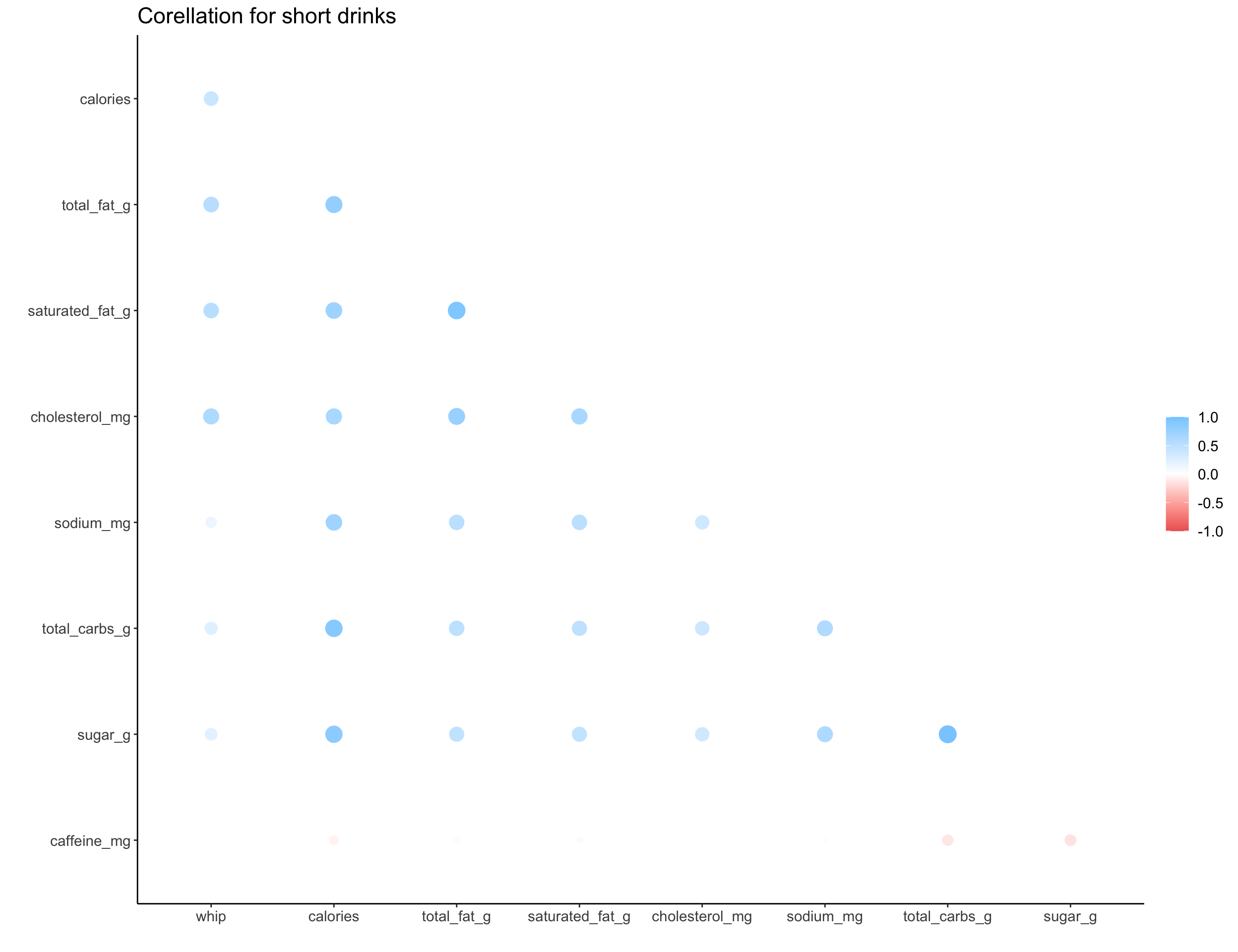
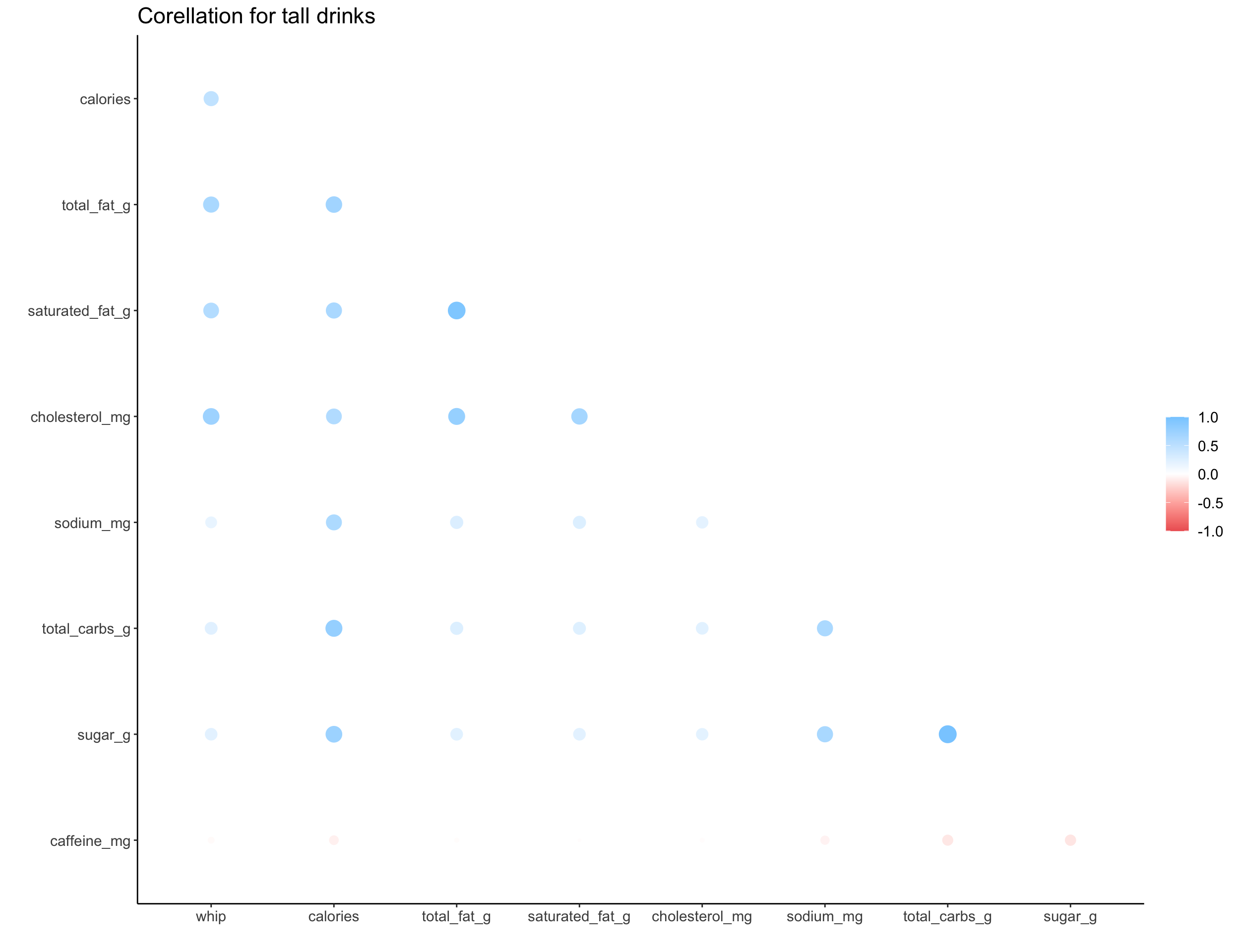
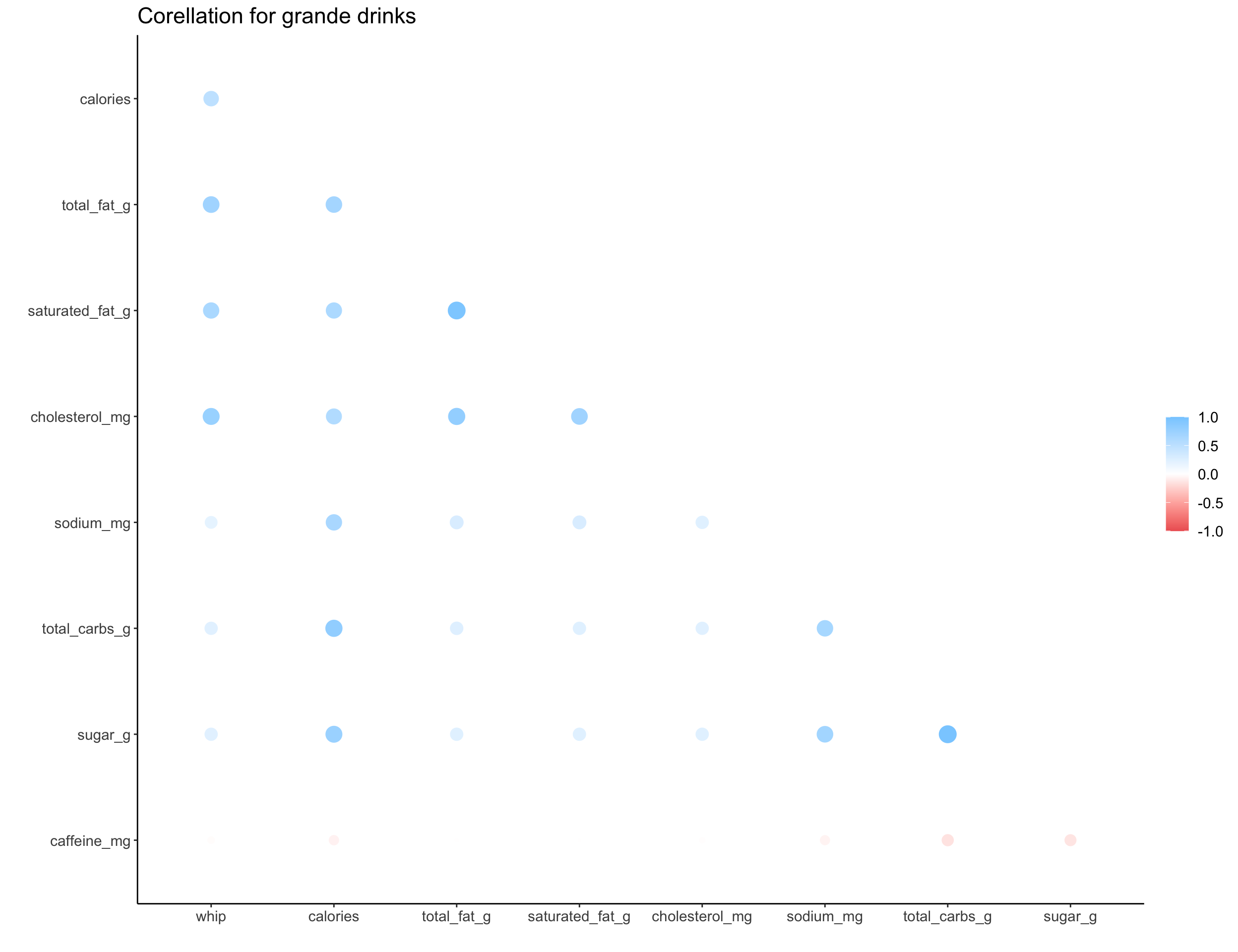
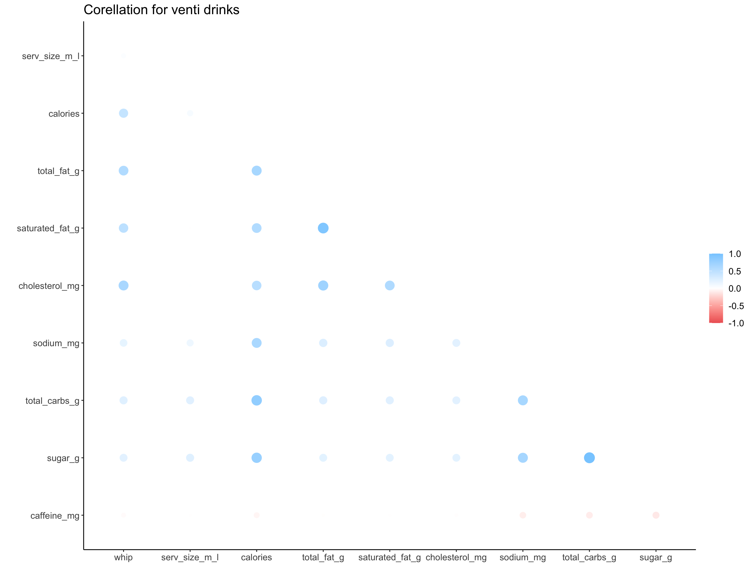
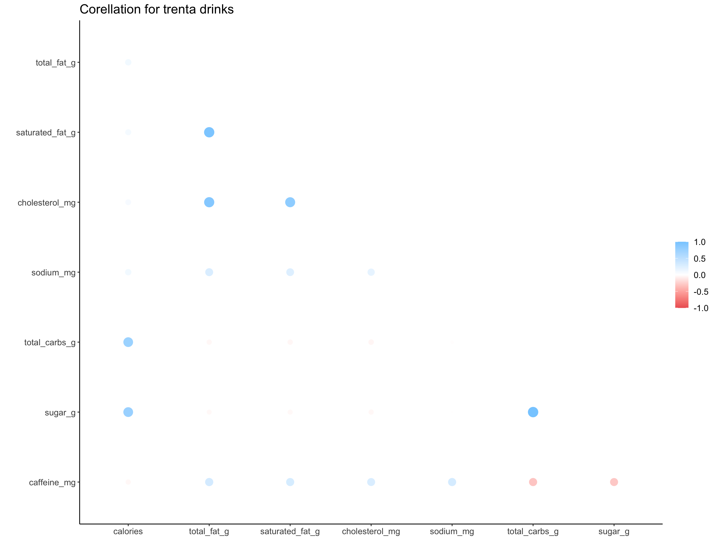
We can explore the correlation structure for numeric data with a correlation plot, where larger circles indicate a larger correlation nd color indicates the direction. The correlation shown here is a measure of linear correlation, which ignores other types of correlation or non-linearities in the data.
get_cor <-
  function(size){
    sbucks %>%
      filter(size == {{size}}) %>%
      na.omit() %>%
      select(where(is.numeric)) %>%
      corrr::correlate() %>%
      corrr::shave(upper = TRUE) %>%
      corrr::rplot() +
      labs(title = glue::glue("Corellation for {size} drinks")) + big_labels
  }

map(c("short", "tall", "grande", "venti", "trenta"), ~get_cor(size = .x))
## [[1]]
##
## [[2]]
##
## [[3]]
##
## [[4]]
##
## [[5]]
whip_diff <-
  sbucks %>%
  select(product_name, size, milk, whip, calories) %>%
  group_by(product_name, size, milk) %>%
  mutate(has_whip_option = max(whip)) %>%
  filter(has_whip_option == 1) %>%
  mutate(whip = factor(whip, levels = c("0", "1")),
         size = factor(size, levels = c("short", "tall", "grande", "venti")),
         milk = factor(milk, levels = c("nonfat", "soy", "coconut", "2%", "whole"))) %>%
  filter(!is.na(calories), !is.na(milk))


whip_diff %>%
  ggplot(., aes(x = whip, y = calories)) +
  geom_jitter(alpha = .5) +
  geom_boxplot(alpha = .75) +
  facet_grid(milk ~ size, scales = 'free') +
  big_labels
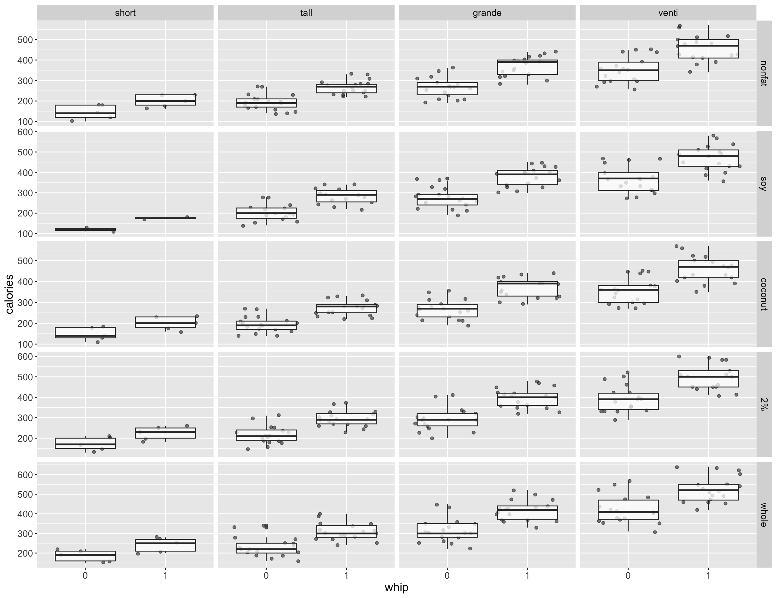
After removing drinks with no milk, we can plot the distributions of calories and inspect for any potential interaction effects. There doesn’t seem to be any interaction effects between whipped cream and milk type used
whip_diff <-
  whip_diff %>%
  filter(size %in% c("grande", "short", "tall", "venti"),
         milk != 'none')

boxplot_milk <-
  ggplot(whip_diff, aes(x = whip, y = calories, fill = milk)) +
  geom_jitter(alpha = .5) +
  geom_boxplot(alpha = .75) +
  # facet_grid(. ~ size) +
  labs(fill = "Milk Type") +
  big_labels +
  scale_y_continuous(breaks = seq(100, 1000, 25))  +
  theme_minimal() +
  theme(legend.position = "none")

line_milk <-
  ggline(whip_diff, x = "whip", y = "calories", color = "milk",
         add = c("mean_se")) +
  theme_minimal()

ggpubr::ggarrange(boxplot_milk, line_milk, nrow = 1, ncol = 2)
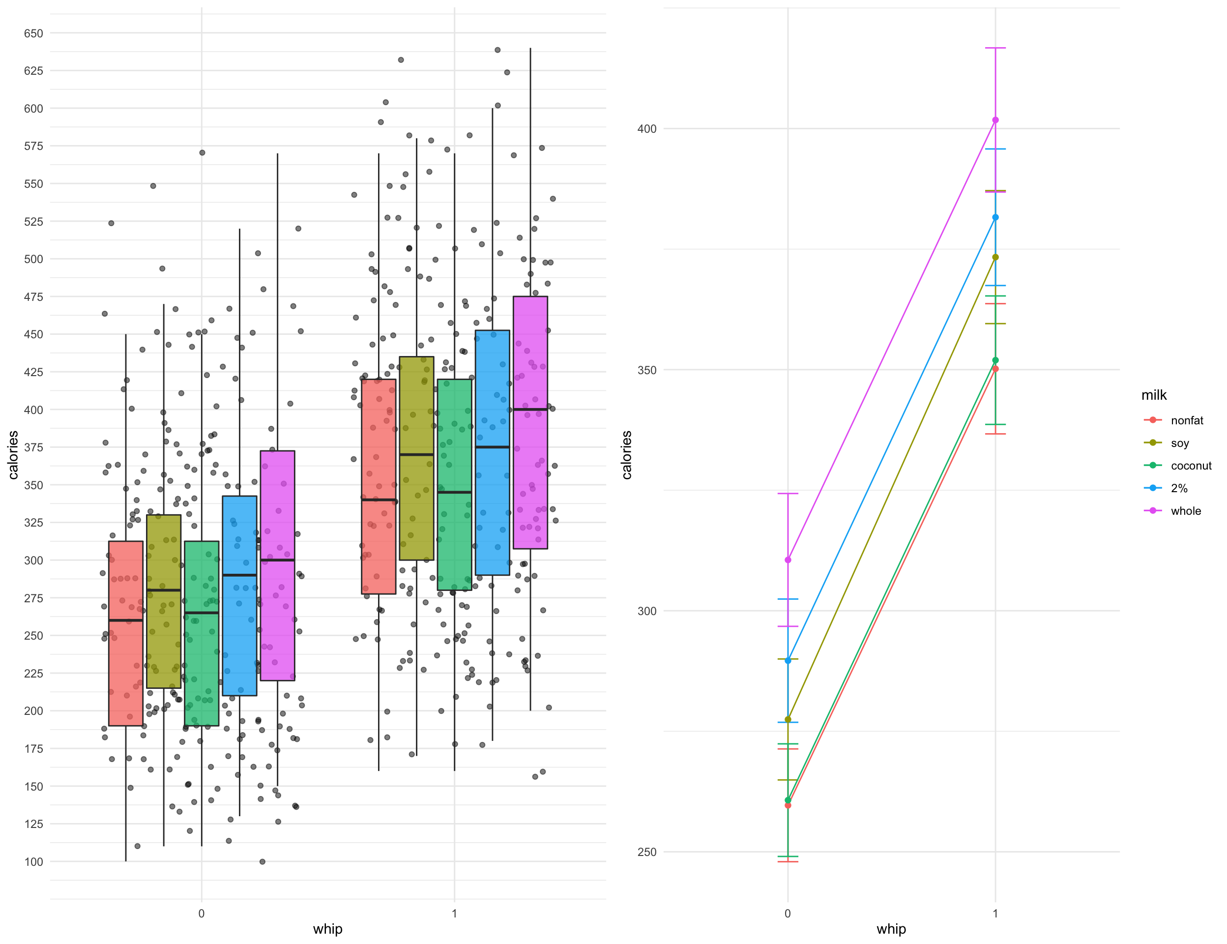
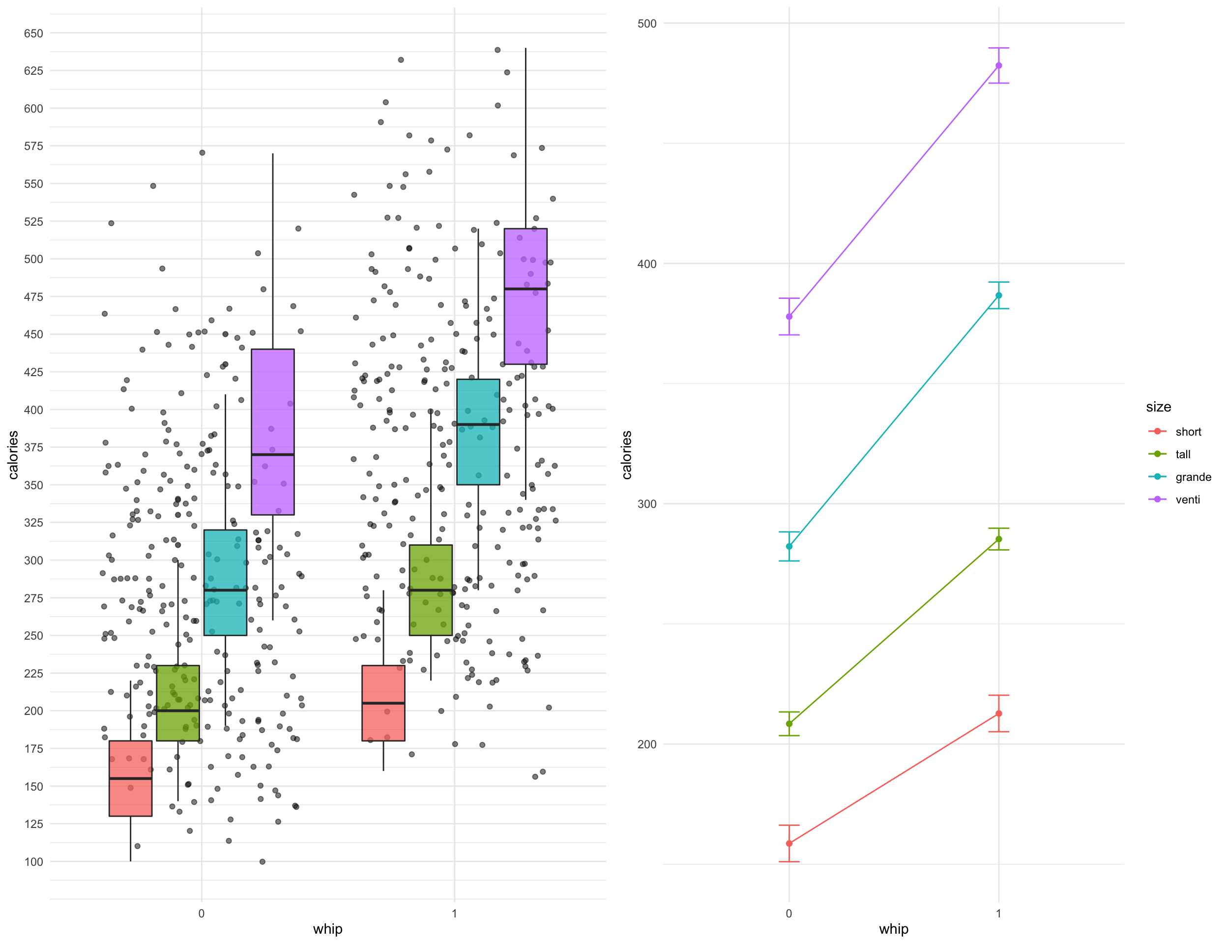
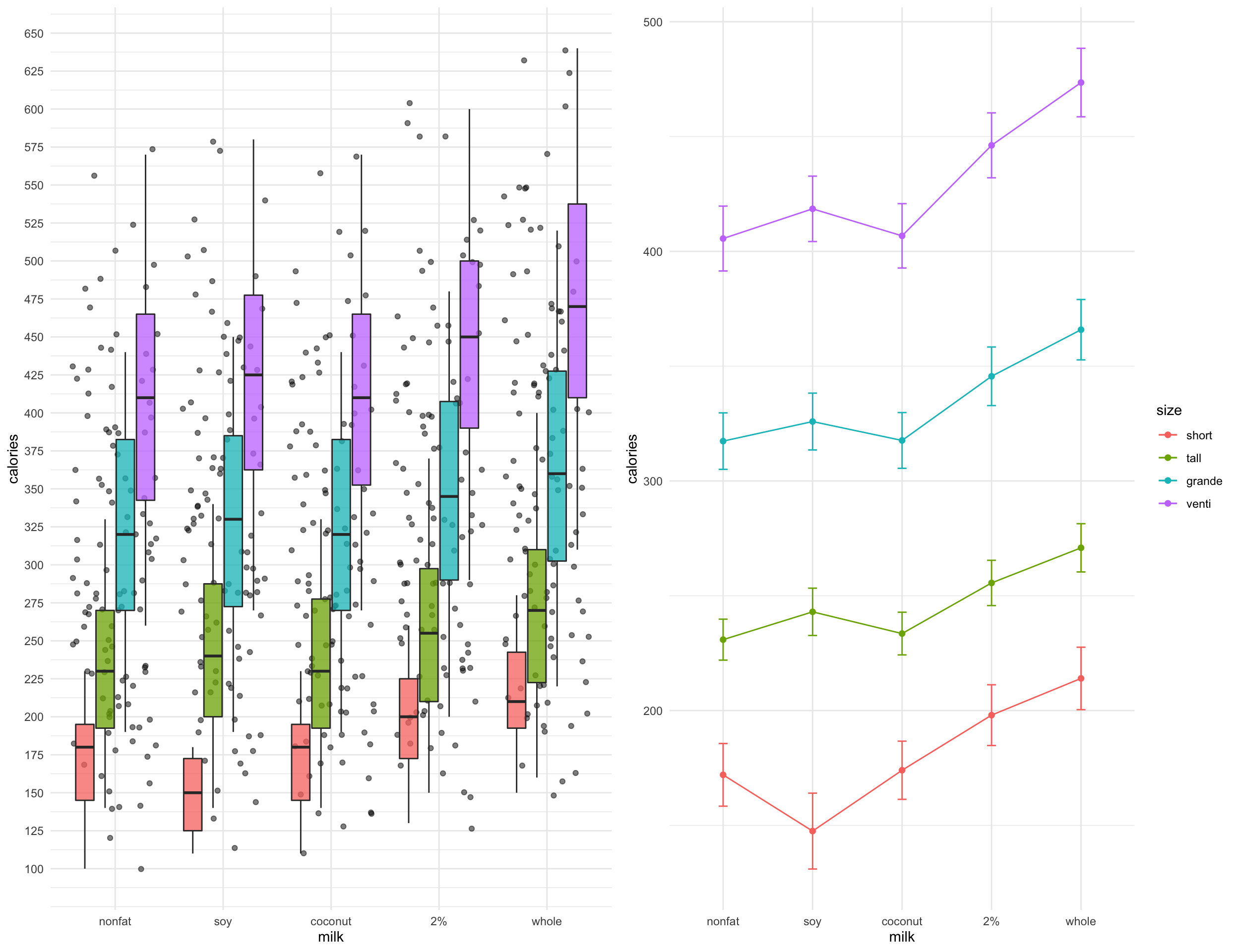
There may be a slight interaction effect between whipped cream and drink size
boxplot_size <-
  ggplot(whip_diff, aes(x = whip, y = calories, fill = size)) +
  geom_jitter(alpha = .5) +
  geom_boxplot(alpha = .75) +
  labs(fill = "Milk Type") +
  big_labels +
  scale_y_continuous(breaks = seq(100, 1000, 25)) +
  theme_minimal() +
  theme(legend.position = "none")

line_size <-
  ggline(whip_diff, x = "whip", y = "calories", color = "size",
         add = c("mean_se")) +
  theme_minimal()

ggpubr::ggarrange(boxplot_size, line_size, nrow = 1, ncol = 2)
There may be a slight interaction effect between drink size and milk used
boxplot_size_milk <-
  ggplot(whip_diff, aes(x = milk, y = calories, fill = size)) +
  geom_jitter(alpha = .5) +
  geom_boxplot(alpha = .75) +
  labs(fill = "Milk Type") +
  big_labels +
  scale_y_continuous(breaks = seq(100, 1000, 25)) +
  theme_minimal() +
  theme(legend.position = "none")

line_size_milk <-
  ggline(whip_diff, x = "milk", y = "calories", color = "size",
         add = c("mean_se")) +
  theme_minimal()

ggpubr::ggarrange(boxplot_size_milk, line_size_milk, nrow = 1, ncol = 2)
Simple model
The next step is to model the relationship between calories and the inclusion of whip cream on various drinks, while accounting for size and milk type. The LM model contains all categorical predictors and is equivalent to a 1 way ANOVA. IN this case we don’t really need to do an ANOVA beause the means are obviously different from one another. The assumptions of homogeneous variance among groups and approximately normally distributed data seem to pass given an inspection of the boxplots above.
$$ \hat{Y}= b_0 + b_1X_1 + b_2X_2 + b_3X_3 + b_4X_1X_2 $$
where:
- Y is calories
- X1 is an indicator for whip cream included (ref level = 0)
- X2 is an indicator for size of drink (4 levels, ref level = short)
- X3 is an indicator for milk type (5 levels, ref level = nonfat)
An interaction term is added since the amount of whipped cream added may vary according to the drink size; maybe Venti drinks get more whipped cream added than a Short drink and if so the impact on calories is not consistent for whipped cream drinks as size changes.
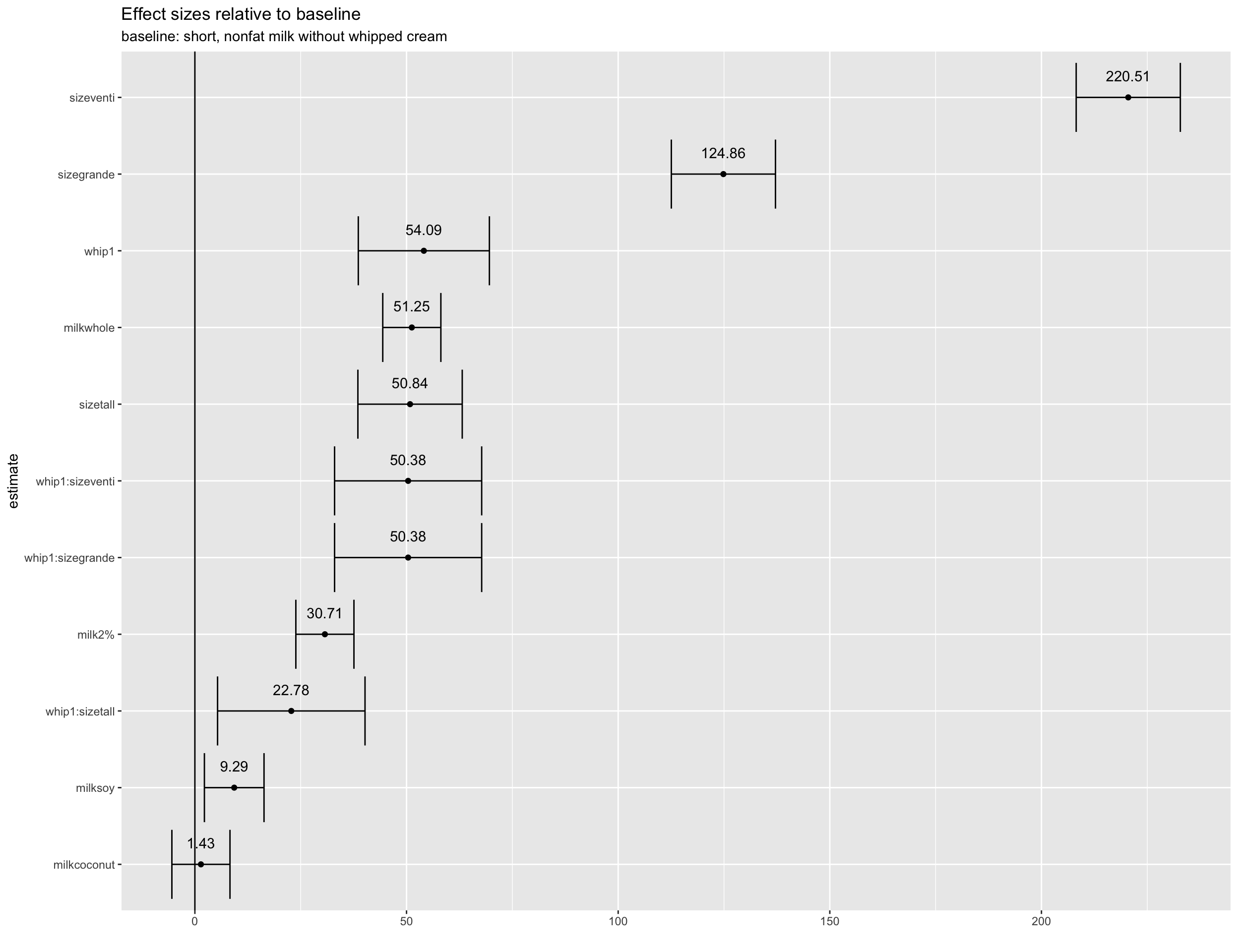
broom::tidy(lm(calories ~ whip + size + milk + whip*size, data = whip_diff)) %>%
  addtable()
The intercept term alone indicates the average calories for “short” drinks with nonfat milk and without whipped cream is about 139 calories. To get the avg calories for a venti with whipped cream and whole milk, for example, we can add:
138.84 + 54 + 220.51 + 51.25 + 50.38 = 514.98 calories
broom::tidy(lm(calories ~ whip + size + milk + whip*size, data = whip_diff)) %>%
  filter(term != "(Intercept)") %>%
  ggplot(., aes(x = reorder(term, estimate), y = estimate, label = round(estimate, 2))) +
  geom_point() +
  geom_text(nudge_x = .28) +
  coord_flip() +
  geom_hline(yintercept = 0) +
  geom_errorbar(aes(x = term, ymin = estimate - std.error, ymax = estimate + std.error)) +
  labs(x = "estimate", y = "",
       title = "Effect sizes relative to baseline", subtitle = "baseline: short, nonfat milk without whipped cream")
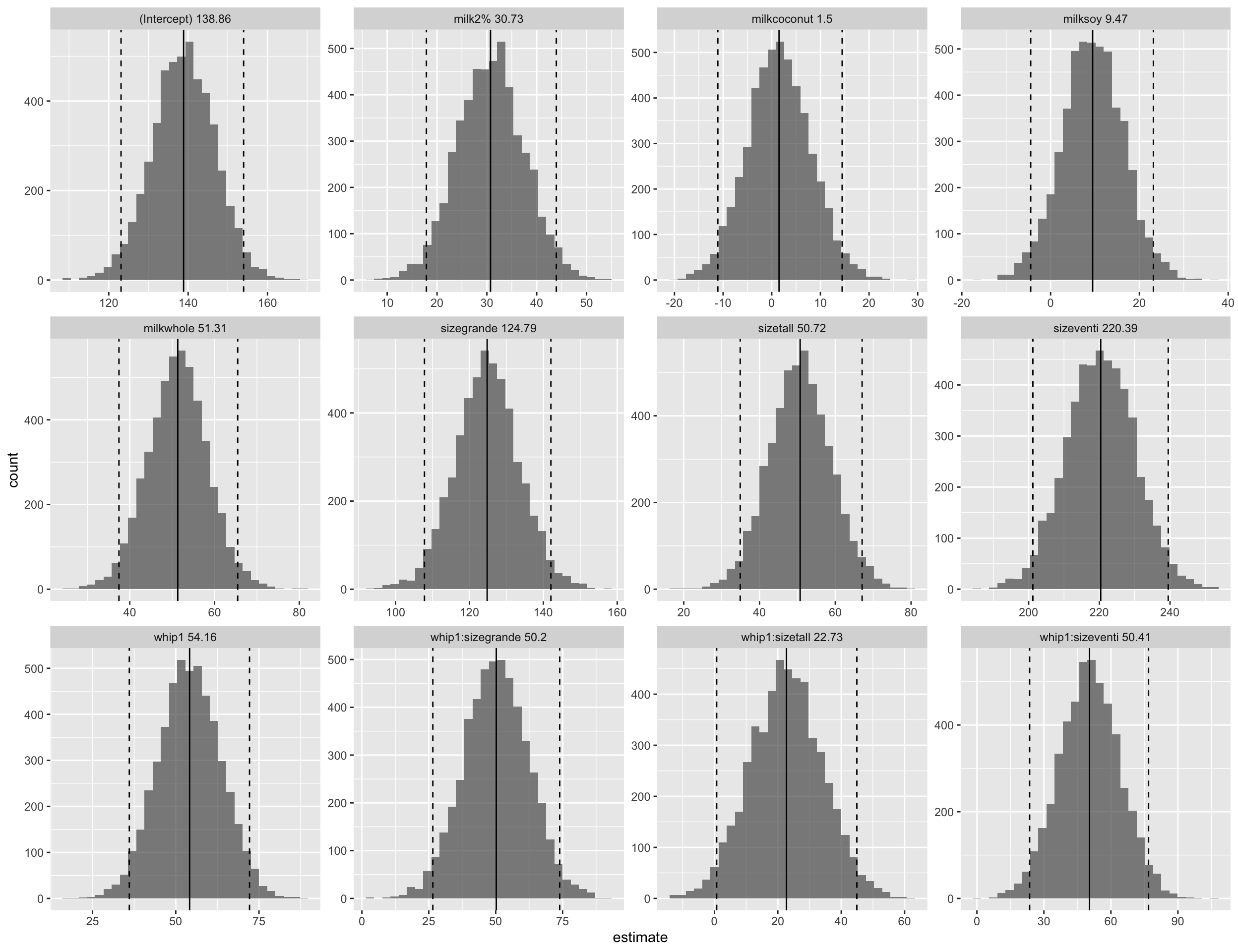
Bootstrap Resampling
There is not a ton of data here, maybe creating some bootstrap resamples might help to model this relationship. Bootstrapping creates N datasets by resampling with replacement. All of the resamples have the same number of rows as the input dataset, and contain duplicate observations since we sampled with replacement. The assessment data are comprised of the observations that didn’t make it into a given resample.
Below are the first 10 resamples of the dataset; each contains 550 observations to fit the model (the analysis split). the remaining observations are the assessment split, but are not used in this case, since we are not doing any model tuning or measuring any performance metrics. The model coefficients will be an average across all 5000 resamples.
# use bootstrap resampling; account for potential interaction effect
set.seed(1459)
samples <-
  rsample::bootstraps(whip_diff,
                      times = 5000,
                      apparent = TRUE)

head(samples, 10)
## # A tibble: 10 × 2
##    splits            id
##    <list>            <chr>
##  1 <split [550/200]> Bootstrap0001
##  2 <split [550/205]> Bootstrap0002
##  3 <split [550/194]> Bootstrap0003
##  4 <split [550/204]> Bootstrap0004
##  5 <split [550/198]> Bootstrap0005
##  6 <split [550/209]> Bootstrap0006
##  7 <split [550/209]> Bootstrap0007
##  8 <split [550/216]> Bootstrap0008
##  9 <split [550/199]> Bootstrap0009
## 10 <split [550/196]> Bootstrap0010
whip_models <-
  samples %>%
  mutate(
    model = map(splits, ~ lm(calories ~ whip + size + milk + whip*size, data = .)),
    coef_info = map(model, tidy)
  )
Based on the plots, the estimates are about the same as the lm above!
whip_coefs <-
  whip_models %>%
  unnest(coef_info)

means <-
  whip_coefs %>%
  group_by(term) %>%
  summarise(est_mean = mean(estimate))

spreads <-
  int_pctl(whip_models, coef_info)

whip_coefs %>%
  left_join(., means, "term")  %>%
  left_join(., spreads %>% select(.lower, .upper, term), "term")  %>%
  mutate(term_label = paste(term, round(est_mean, 2))) %>%
  ggplot(aes(x = estimate, label = est_mean)) +
  geom_histogram(alpha = 0.7) +
  facet_wrap(.~term_label, scales = "free") +
  geom_vline(aes(xintercept = est_mean))+
  geom_vline(aes(xintercept = .lower), linetype = "dashed") +
  geom_vline(aes(xintercept = .upper), linetype = "dashed")
Conclusion
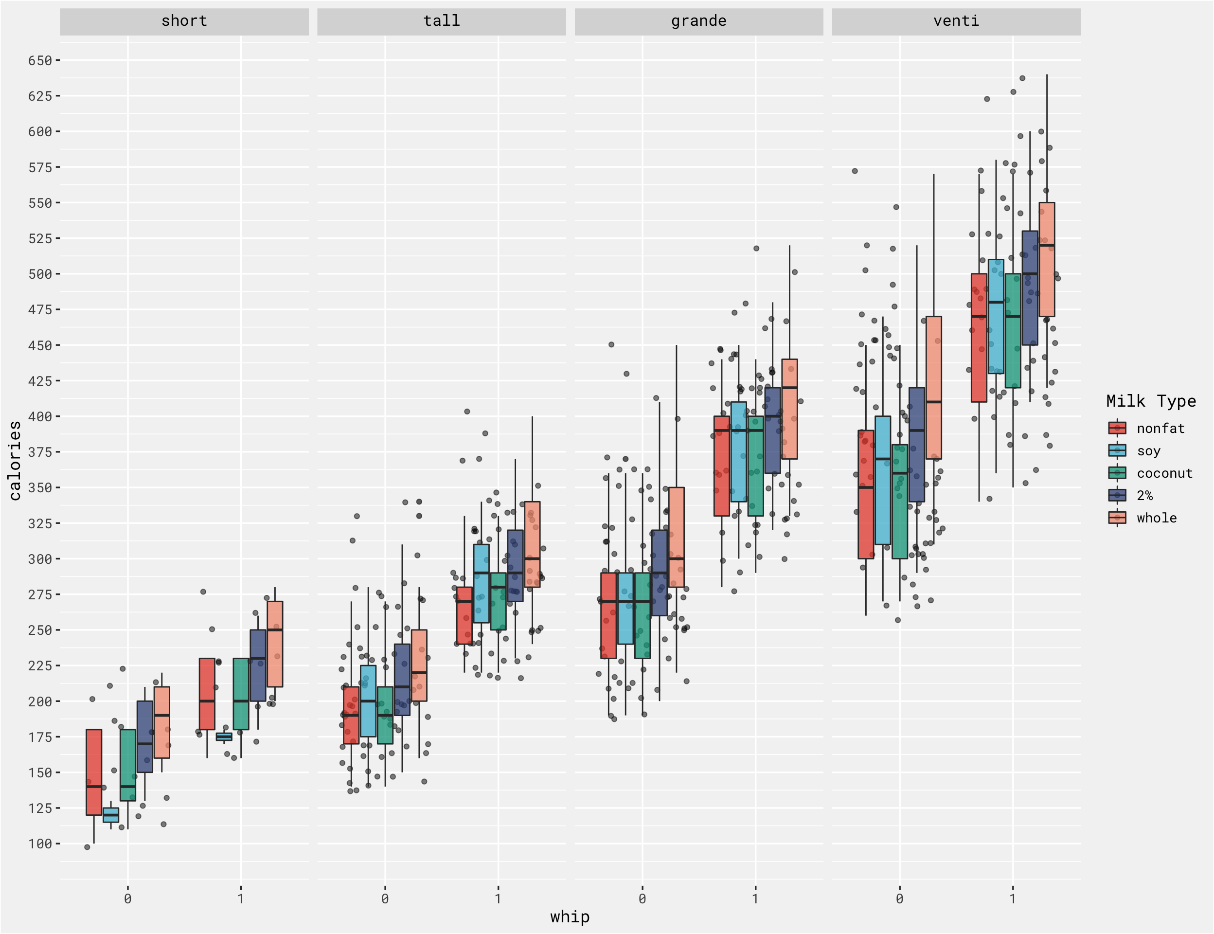
These 2 methods are similar ways to accomplish the same goal, and in this case we got similar result. In fact, a simple faceted boxplot could have saved a ton of time and shown us the same results - calories differ across whipped cream options, milk options and size options!
ggplot(whip_diff, aes(x = whip, y = calories, fill = milk)) +
  geom_jitter(alpha = .5) +
  geom_boxplot(alpha = .75) +
  labs(fill = "Milk Type") +
  big_labels +
  facet_grid(.~size) +
  scale_y_continuous(breaks = seq(100, 1000, 25)) +
  bg_theme() +
  ggsci::scale_fill_npg()
- Posted on:
- December 21, 2021
- Length:
- 7 minute read, 1460 words
- Categories:
- tidy tuesday tidymodels data science